Google Updates Its ‘G’ Icon After a Decade with a New Gradient Look
Google’s design evolution is making headlines again—this time with an update to the iconic single-letter ‘G’ icon. It’s not the kind of visual shift that screams for attention, but once you notice the new gradient-rich look, it’s hard to forget.
This is the first major tweak to the ‘G’ since 2015, marking a fresh design moment in Google’s ongoing visual journey.
The First Change in 10 Years
Back in 2015, Google replaced its traditional serif logo with the current sans-serif version using its proprietary Product Sans typeface. Along with that redesign came a new circular ‘G’ made up of Google’s four signature colors—red, yellow, green, and blue—separated into solid, defined sections.
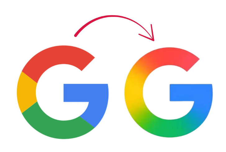
Instagram | theinfomance | Google’s updated look features soft, blended transitions between its iconic colors.
Now, Google is moving away from that blocky, segmented appearance. The updated version blends those familiar hues together with soft transitions—red flows into yellow, which gently fades into green, and finally merges into blue. This gradient-driven style gives the logo a more fluid, modern energy, echoing the design language seen in Google’s AI-related visuals, particularly the Gemini branding and AI Mode in Search.
Where the New Icon Is Appearing First
The updated icon has already made its way to iOS with the latest version of the Google Search app. Android users started seeing the change with the beta release of Google app version 16.18. While subtle, the shift is easier to spot on app icons than in smaller places—like browser tabs—where it appears as a tiny favicon.
Those primarily using Google services via mobile might not immediately notice the refresh, but it becomes clearer with time. It’s a quiet rollout, not an announcement-style event, but it still reflects a significant visual decision by Google’s design team.
What’s Staying the Same—For Now
Despite the change to the ‘G’ icon, the six-letter Google wordmark is not being updated. There’s no current indication that other major products—such as Google Chrome or Google Maps—are undergoing icon refreshes either. Still, because these apps use similar four-color schemes, they could potentially adopt this new blended look in the future.
The move signals Google’s shift toward a more unified, soft-edged design system without shaking up its recognizable visual identity. The blend of colors brings more depth and movement, which aligns well with Google’s AI-powered tools that are quickly becoming a bigger part of the experience.
Google’s New Look Signals a Quiet but Powerful Shift
Instagram | the_mainstreamofficial | More than aesthetics, the redesign unifies Google’s brand across its diverse products.
Google’s latest icon redesign may appear subtle, but it carries strategic weight. The softened edges and smoother color transitions are more than just aesthetic upgrades—they signal a broader shift in Google’s design language, aligning with its push toward a more intuitive and AI-integrated user experience.
Rather than making loud announcements, Google is choosing quiet evolution. By updating a small but symbolic element like the ‘G’ logo, the company reinforces its commitment to innovation and coherence across its expanding ecosystem. It retains the recognizable identity users trust while adopting a more expressive, forward-looking style.
This change isn’t just about branding—it’s about preparing users for a future where AI and thoughtful design go hand in hand. As Google continues to embed assistive intelligence into its tools, expect more visual cues like this: small, smart, and quietly transformative.